Understanding the components of a demand curve is fundamental for economics students, market analysts, and business professionals. Among these components, the horizontal axis of a graph that shows a market demand curve holds particular significance, as it provides valuable insights into consumer behavior and market dynamics. This article will explore the meaning and relevance of the horizontal axis, its relationship with the vertical axis, and its implications for businesses and economic analysis.
What Is a Demand Curve?
A demand curve is a graphical representation of the relationship between the price of a good or service (shown on the vertical axis) and the quantity demanded (shown on the horizontal axis) over a specified period. Typically, the demand curve slopes downward from left to right. This slope reflects the law of demand, which states that as the price of a good increases, the quantity demanded decreases, assuming all other factors remain constant.
The demand curve is a core element of microeconomics and serves as a useful tool for businesses, policymakers, and economists to visualize and predict consumer behavior in a market.
What Does the Horizontal Axis Represent?
Simply put, the horizontal axis of a demand curve graph represents quantity demanded. This refers to the number of units of a good or service that consumers are willing and able to purchase at different price levels. Each point along the horizontal axis corresponds to a specific quantity that consumers desire at a given price.
Why Does This Matter?
The horizontal axis provides critical information that can help in:
- Analyzing Market Behavior: By plotting the quantity demanded for various prices, businesses can gauge consumer reactions to pricing changes.
- Calculating Total Demand: Businesses and analysts can sum up the quantities demanded by individual consumers to determine market demand.
- Identifying Trends: Seasonal changes, economic conditions, and market dynamics often influence demand, and the horizontal axis helps visualize these shifts.
For example, if a graph represents demand for coffee in a specific city, the horizontal axis will show how many cups of coffee consumers are willing to buy at prices ranging from $1 to $5. Understanding these numbers equips coffee vendors to make informed decisions about pricing and supply.
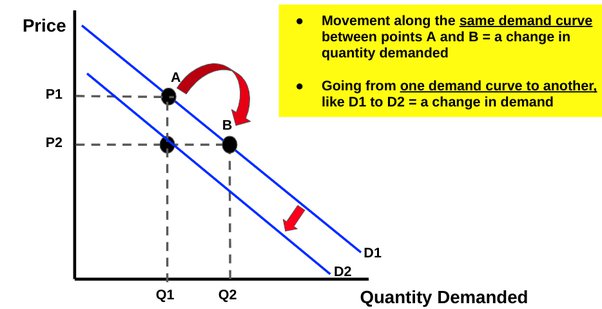
When Quantity Demanded Changes
The relationship between price and quantity demanded changes as prices rise or fall, which leads to movement along the demand curve. Here’s how these movements are reflected on the horizontal axis:
- Price Decrease → Quantity demanded increases, moving further along the horizontal axis to the right.
- Price Increase → Quantity demanded decreases, moving further along the horizontal axis to the left.
However, it’s crucial to note that such changes in quantity demanded are often influenced by other economic factors, such as income levels, tastes, and availability of substitutes.
Horizontal Axis and Elasticity of Demand
The steepness or flatness of the demand curve can also inform us about the elasticity of demand, which measures how sensitive consumers are to price changes. The horizontal axis plays a role in showing this sensitivity:
- Elastic Demand Curve:
-
-
- A flatter curve means a small price change leads to a significant change in quantity demanded.
- Common for luxury items or goods with plenty of substitutes.
- On the graph, the horizontal axis shows a wide range of quantities for a narrow price range.
-
- Inelastic Demand Curve:
-
-
- A steeper curve means price changes have little effect on quantity demanded.
- Common for necessities like medication or utilities.
- On the graph, the horizontal axis shows only slight changes in quantity demanded even when prices fluctuate significantly.
-
For example, a demand curve for electricity might show only minor shifts along the horizontal axis for large changes in price, reflecting its inelastic nature.
Individual vs. Market Demand Curves
It’s also important to distinguish between individual demand curves and market demand curves:
- Individual Demand Curve:
- Shows how much of a product a single consumer is willing to buy at varying price levels.
- For example, Joel might buy four slices of pizza at $1.50 per slice but would buy six slices if the price dropped to $1 per slice.
- Market Demand Curve:
- Aggregates the quantities demanded by all consumers in the market.
- The horizontal axis on this graph represents the total quantity demanded for the entire market at various prices.
Market demand curves are typically flatter than individual demand curves, as the overall demand in a market is more proportionate to price changes.
Shifts in the Demand Curve
While movements along the horizontal axis result from price changes, shifts in the demand curve reflect changes in external factors such as:
- Consumer Preferences:
- Increased popularity of a specific product can shift the curve to the right, increasing the total quantity demanded at all price levels.
- Income Levels:
- If incomes rise, consumers may demand more of a product, shifting the curve to the right on the horizontal axis.
- Conversely, a drop in income shifts the curve to the left.
- Prices of Substitutes or Complements:
- If the price of a substitute good rises, consumers may buy more of the original good, increasing demand and shifting the curve to the right.
- Conversely, an increase in the price of a complement may reduce demand, shifting the curve to the left.
These shifts are crucial for understanding trends beyond price and quantity changes. For example, a growing appetite for plant-based proteins could cause demand for traditional meat to shift left while demand for plant-based alternatives shifts to the right.
Practical Implications for Businesses
For businesses, understanding the data represented on the horizontal axis is crucial in making strategic decisions such as:
- Pricing Strategies:
Analyzing the quantity consumers are willing to buy at different prices helps businesses identify an optimum price point that maximizes revenue.
- Production Planning:
Understanding quantity demanded allows businesses to align their production output with market needs, avoiding overproduction or underproduction.
- Marketing and Promotions:
Businesses can use demand insights to craft targeted campaigns aimed at increasing market demand, effectively shifting the curve itself.
Final Thoughts
The horizontal axis of a graph that shows a market demand curve is not just a representation of quantity; it’s a roadmap for understanding consumer behavior and market dynamics. For businesses, economists, and analysts, interpreting this axis effectively provides the foundation for informed decision-making and strategy development.
Whether you’re a student trying to grasp economic principles or a business professional aiming to leverage market data, mastering the concept of the horizontal axis on a demand curve is essential. Understanding what it indicates can transform raw data into actionable insights, helping you succeed in an increasingly competitive marketplace.